Marche Not in Mar but in Design Trend
I am meilin currently pursueing a diploma
in moving images. this is blog is actually
my work for my assignment for design trend.
With the help of some nice friend
i came up with this.
It might be simple,
but i hope you like it.
Thursday, September 13, 2007
3:47 AM

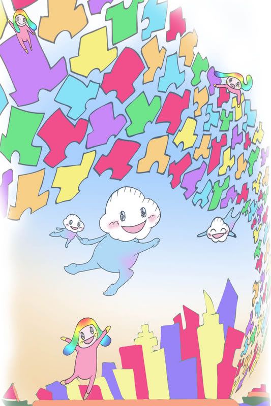
This is my final piece of work for my assignment for design trend.
Titled: Sky high Goods
The rationale
My piece of work is one about consumerism.
The Definition of Consumerism is the ever expanding consumption of goods is beneficial and advantageous to the economy. That what i wanted to protray. So i infused Takashi Murakami style of Superflat and the cute looking character he often have in hisartwork. But this is not just Takashi Murakami, this is so me. Hence i used softer colours to bring out my style and chracters with a special theme, sky, to bring out my style.
3:23 AM
here are the developments on my pictures and the works that i had done.
here are some of the blog skin that i had done for this assignment. i had spend i considerable amount of effort working on them. Btu was unfortunately told to put of ifnal image as our blog skin. The pink foot was the first on i started follow by the other two.
These are the different pieces that i had done for the final assignment. As you can see there were alot of small little changes being done to the pictures.

Monday, September 10, 2007
10:16 PM
My illustrating style is varies from time to time, this is also applicable to the art works that i do. I think this is so as my personal visual style to learn as i observe. Hence i do have the habit of getting influenced by the artist when i taken a liking to his works. So you can see some of my artworks has the influence of different artist.
I also like to develop my own characters as i feel that it can give me a sense of identity regardless of it in my works and myself as a going-to-be designer. Most of the characters i designed are quite cute and some even said that it look diablolical, which i think it is abit to exagerating. I also like to create a backgroud for my characters so people can know more about them and their characteristics.
There is actually quite a number of characteristics to my visual style. I like my pictures to have contrast. Hence the colors that i used in a art work would varies alot from strong to low contrast. I think highly contrast means that the color tone would be richer and stonger. I also like to used a lot of color in my artwork as i think it would make it look vibrant and even sometimes cheerful.
When i do black and white fanart, i like to emphasize the details on my characters. To me, a black and white artwork don't necessary look boring and dull. Hence, i did alot of cross hatching and line works on my artworks. I think it would make it look better and enhance the entire outlook of the picture. This is also something that i cannot do using imageing softwares.
As for the pictures i take, i want them to look more then what they are. I want my viewers to see more then what the object is, or see the emotion in the person in the photograph.
There is a saying, " a picture speaks a thousand words". I always tries my best to let people see this in my pictures, hence i hope you can see it too in my portfolio.
Friday, September 7, 2007
3:47 AM
 村上隆, Murakami Takashi
a prolific contemporary artist from japan.
He is well known for his work at both fine arts media, painting, digital and commercial media. He likes and try to blur the boundnaries between high and low art. He also likes to incorporate popular themes from the mass media and in trend pop cultures and turn them in to huge sculptures, wall paintings to even commercially marketable things like phone caddies.
He is also well known for developing the art movement call Superflat, which also act as a medium for him to examine the elements in his design value and to create his work. And also his design for Louis Vuitton color monogram handbags.
I was first attracted to him because his style of work is like a mixture of his western predecessors, Roy Lichtenstein, Andy Warhol and Claus Oldenberg. They are also the artist that i like and had inspired me in some of my works before, beside that i also find his artwork very interesting. Hence i decided to do on him.
his design philosophy is very special and interesting, it is "devoid of perspective and devoid of hierarchy, all existing equally and simultaneously". This was said by him during an interview about Superflat and himself.
His design is also the things that he wants to convey to others through the work pieces. They are otaku lifetyle, otaku sub culture, consumerism, sexual fetishism, post-war psychology and scars left by the war(its aftermath). All these are issues that affects Japan today and is the current situations that Japan faces.
His visual style is very unique to me as it is not really in fine-arts medium. It is mostly protrays on flat planes on colors or graphic image, involving character style that is highly influenced from Anime and Manga. Usually express his feelings in artwork in forms of creepily cute creatures and some times even on pornography. it is mostly on 2d or sculptures.
A video taken from Youtube showing Superflat monogram he did for Louis Vuitton. it looks very cheerful and it is a true eye candy =D.
some examples of his artworks


all this
images are taken from www.superflat.tribe.net/photos


